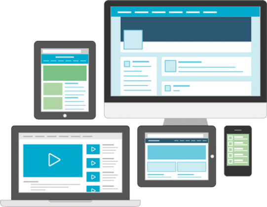
Responsive websites
As the growth of the mobile and tablet market rapidly continues to move forward - so should you. If your website isn’t ready for mobile visitors then you’re missing out - big time.
Here at Fractas we love a responsive approach as most of our websites are responsive in nature.

PERFECT PERFORMANCE
With extensive testing and optimization every single website is tailored to perform perfectly on a wide variety of devices and screen resolutions

BOOTSTRAP FRAMEWORK
100% of our responsive websites are built on the powerful Bootstrap framework which we specially optimize for maximum performance

READY FOR FUTURE
Constant monitoring and support with regular updates of core technologies and frameworks will make your website ready for future demand
Why should I make my website responsive?
With the expanding market of mobile phones and tablets and their increasing share of internet traffic, a fresh approach of website development philosophy was born: RWD (Responsive Website Development). Responsive simply means the website adapts to the user’s device.
Customer expectations are growing. Potential customers won’t think twice about leaving your site for an alternative that displays nicely on their mobile devices. Keep your potential customers and meet their expectations with a responsive site.
Get started with Responsive website!
Request pricingBenefits of Responsive Web Design
One website - One content - Multiple devices
There’s no need to create various types of content adapted to different devices

The same content on all devices supports better ranking on various search engines

The expenses and development time are cut significantly

An increase in page speeds and better user experience